Case study : Patrick Roger web-app
March 06, 2019ICI LA LUNE proposes, with the realization of the web app of the chocolate maker Patrick Roger Meilleur Ouvrier de France, its vision of communication on the Internet, a digital territory where content and user interactions are mixed in an original and lively way.
No more boundaries between brand experience and e-commerce
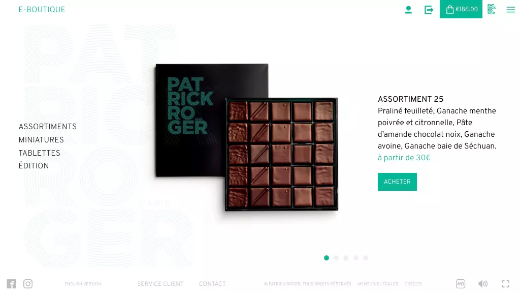
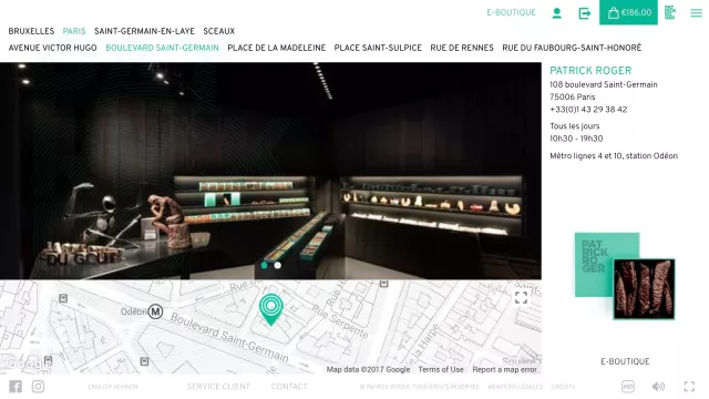
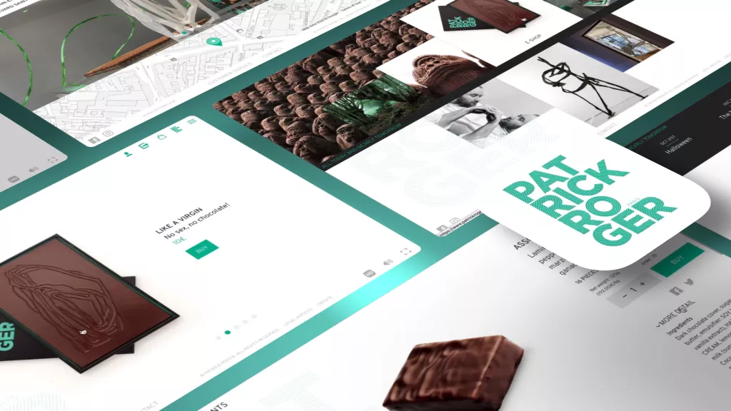
The challenge of this new version of patrickroger.com was to unify the digital experience of the Patrick Roger brand and the e-commerce experience, which were previously separated into two separate sites. All Patrick Roger brand content is now accessible from mobile to large HD screens via the same web application.
The design and the care taken in the realization of the e-commerce experience do not suffer from the strong design constraints linked to the usual frameworks which, in most cases, standardize the user experience.
A screen approach
The patrickroger.com web application proposes a display of information on the screen exploiting all the available space while taking care to preserve a certain minimalism.
Thus, no information is hidden because of a browser size too small, without the usual scroll in search of information not visible.
This approach allows to define, for each content, each url, the importance of the information to be communicated and to put aside what is superfluous.
The quest for the essential
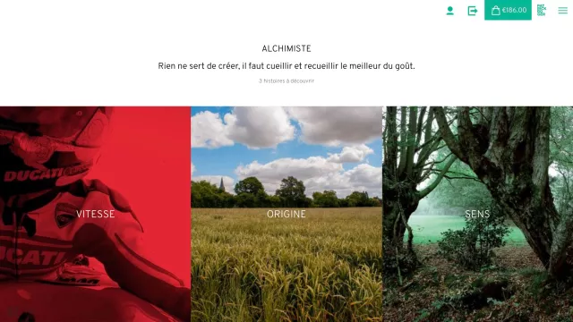
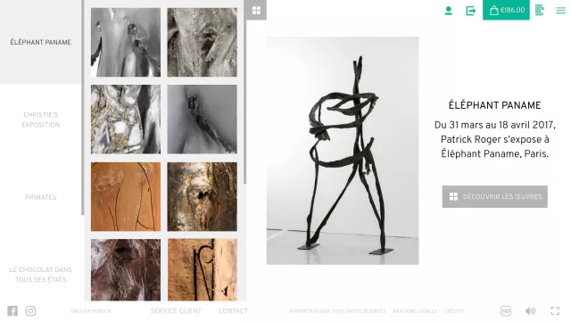
The design focuses on the essential, the place is given to the impact of the images, when the text is reduced to its simplest expression.
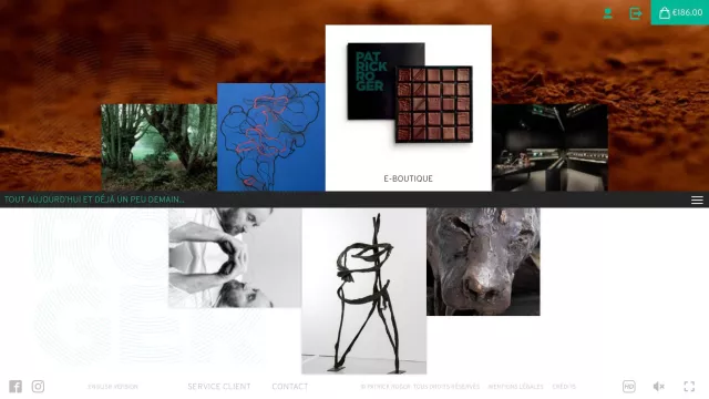
We wanted to emphasize Patrick Roger's dual approach, his activities as a chocolatier and sculptor. To do this, we designed the home screen with a horizontal symmetry that marks the border between the two worlds.
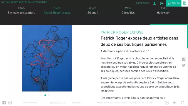
This boundary is materialized by a retractable black strip that contains Patrick Roger's news feed, bringing together his 2 worlds.
Mobile First ?
This magic formula is a fashionable shortcut to make people believe that a web experience can be reduced to its smallest common denominator: the smartphone screen, and then be adapted to all larger screens. This is more akin to pure mechanics than to a thorough reflection in terms of user experience and creative territory.
At ICI LA LUNE, we do not subscribe to this reductive precept which aims to level down, as we see today in the web landscape where all the pseudo good practices end up creating ready-made ideas that are replicated everywhere.
For patrickroger.com, we wanted to create a creative, unique and interactive experience, taking advantage of the display capabilities of computers and tablets. The smartphone version is radically different, emphasizing the speed of access to information in a vertical navigation mode.
Quality media, HD mode
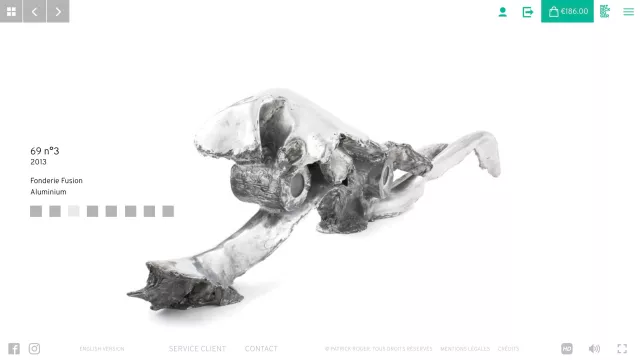
The place of photography is preponderant at Patrick Roger and we must find solutions to highlight them. Thus we have set up a dynamic media management system which aims at each moment to display the image in the most adapted size according to the dimensions of the screen. This choice aims at a quality objective in relation to the sharpness of the image but also a quantity objective, aiming at not loading an image that is too big, therefore too heavy, for nothing.
To achieve this objective, we also wanted to take into account the high definition screens and thus propose an HD mode to the Internet users who have such screens. This HD mode is accessible in the footer (only for users with such a screen) and allows to load images with a pixel density twice as high.
Dynamic Music Experience
We believe that music is an integral part of an interactive experience. We consider it to be as important as image and typography in creating a sensory universe for a brand. The digital medium and real time allow us to imagine new and stimulating modes of musical expression around the sound identity of a Brand. Thus, a music in a web application can have depth and unfold in time in an unprecedented way.
For example, on patrickroger.com, we have imagined with Musa Machina a dynamic musical dressing whose tracks are mixed in real time according to the contents that the Internet users visit or according to the position of the cursor on the screen.
On the home screen in particular, when you move your cursor over the upper or lower blocks, different musical tracks appear and are mixed in real time.
Behind the user experience lies a solid technological know-how
SPA, Single Page Application
The patrickroger.com web application is a SPA, Single Page Application. It is an application that ensures the life cycle of content that is displayed while users navigate from one url to another. This guarantees users a smooth navigation and fluid transitions when moving from one content to another.
It is both a guarantee of user comfort and also a much more open and qualitative creation context. Even if this notion of SPA is quite new in the HTML5 world, we don't forget that this is the kind of realization we were doing more than 10 years ago, but in Flash.
An open-source back-office that has proven itself: Drupal
ICI LA LUNE has a solid experience with Drupal, the agency uses it in all its projects since 2007 and its version 6.0. All the contents of the web application are modeled, filled in and translated in Drupal, which has become over the years THE reference for content management systems.
A powerful HTML5 framework : AngularJS
AngularJS is an open-source framework developed by Google that allows you to create SPAs and to control the life cycle of all the elements that are displayed on the screen according to the urls consulted.


